PG Thikriwala Gurmukhi/Punjabi TrueType font
Thikriwala is a family of five clean, upright, highly-legible, display fonts of which four are openface varieties and one solid. There is a further Thikriwala font that is used to provide the openface varieties with an easy and accurate fill of a different colour or texture or whatever is required.
To make use of the fill, you will have to download the 'PG Thikriwala 0 Mask' font as well as any others that you need - or download them all.
These are the PG Thikriwala fonts that are available...

Underscore - The space above the font is fairly tight and there are special character combinations for bihari- laanve- dulaanve- horda- and kanorda-bindi combinations (as well as a few others) where a special glyph is chosen from the font (sorting out these special cases can take a significant proportion of a font's development and this is something that people who only design Latin fonts don't realise).
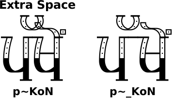
However, sometimes you will get collisions such as, in the text below, at the second word of the second line, (ਪੱਖੋਂ) where the adhak and the horda collide. To solve this, you can add an underscore which gives you an extra little bit of space - you can fine-tune this with your image processor's tracking if you want to. This will work in unicode as well as ASCII but if you need to add the space before the adhak, you will need to make the preceding character ASCII, otherwise, the adhak will show a coding error (the circle of dots with adhak above and to the right of its centre).
You can, of course, use the underscore character to space out the letters any way if you want to.
PG Thikriwala makes a good display font but it is also legible enough to be useful in body text.
You can see in the image on the right that the 'Open' (1) and 'Solid' (5) variants are useful at this scale because there is no loss of detail. However, in the 'Dotted' (2), 'Lined' (3) and 'Scotch Rule' (4) variants, the internal details start to get lost and the results are less not entirely satisfactory.
So, whilst all five variants are perfectly suitable for display work where you have a large point/pixel size where the fine detail of the fonts can bee seen easily, the smaller body-text role really only suits the Open and Solid variants where there is no internal detail.
The example below uses 51pixels as the height of the text (this is from the top of the sihari/bihari to the bottom of the paer-wawwa/dulaunkard) The best way to find out is to experiment for yourself.

Hinting allows you to align the filled pixels in the font with the pixels that the font will be mapped to thus making for an apparently sharper typeface when the pixel/point size is small and the lines in the font are only a few pixels across. It does this by moving the text slightly so that the pixels and the vectors in the glyphs align and in doing so, it changes the height and the width of the characters.
In the example below, I have shown what happens with a 51 pixel high piece of text without any hinting and with hinting.
Whilst the text itself is all right, the fact that hinting does not act the same on different fonts means that when you use the mask font, with hinting, it is rendered differently to other fonts with hinting. As you can see, the mask font does not match up with the open font if hinting is selected.
The hinting does this regardless of the size of the font so it does it the same number of pixels if your text is 51 pixels high or 512 pixels high. However, the hinting just changes the number of pixels wide and high by the same, it is not proportional so whilst it really messes up fonts that need to be matched at small sizes, it is barely noticeable at large font sizes. However, at large font sizes, you don't need to use hinting because the width of the strokes in the font are many more pixels wide.
In conclusion, when you are matching the pixels up in two fonts such as the mask font and one of the others, don't use hinting because: when the font is small, the hinting changes things too much; and, when it is large, you don't need it any way. Additionally, I have not hinted the font itself so your image processor is guessing any way.

Production of two-layer-text images - So, here is how to use the mask font with one of the hollow fonts.
You can, of course, just use one of the hollow fonts (1..4) but if you want the interior to be another colour - or to use the interior for another texture/colour/gradient et cetera - you can use the mask font.
In the example below, I have a blue background (3) and have typed out ਠੀਕਰੀਵਾਲਾ using the '0 Mask' font (2) in yellow.
Next, I have simply duplicated that text layer and then changed to one of the other Thikriwala fonts and changed the colour to black.
Underneath, you can see the result. It is as simple as that.

Another use of the fact that the openface and solid fonts haven't got the fine detail to lose is that you can use one of the detailed fonts as the main title and either the open or solid variant as a subtitle with smaller text like the example below.

Below is article one of the Universal Declaration of Human Rights with PG Thikriwala used as a body font and as you can see, at this scale, there is enough room for detail in the font size to allow for one of the partially filled versions of the font to be used.

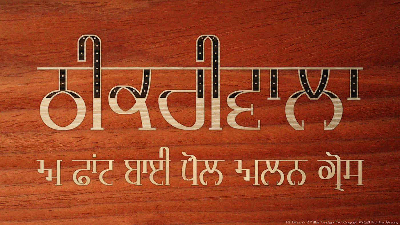
PG Thikriwala used both as a display (for the name of the font) and as body text underneath showing how to use a mixture of versions in the same image thus satisfying the 'keep the number of font families to a minimum' rule in this marquetry image with four different types of veneer.
You can download the PG Thikriwala font family from my site here: http://www.billie.grosse.is-a-geek.com/resources-03yi.html
